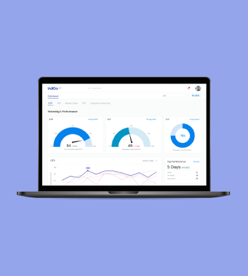
Improved data visualization for better decision making
Industry
Airline
Timeline
1 month
Challenge
Indigo needed a dashboard tailored for its CFO and senior finance executives, offering a clear, concise snapshot of key financial data. The goal was to ensure quick, intuitive access to critical metrics, enabling effective governance and informed decision-making.
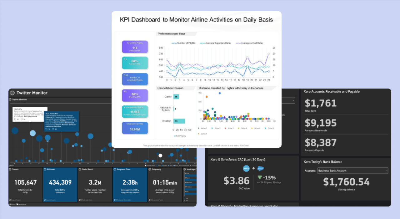
References
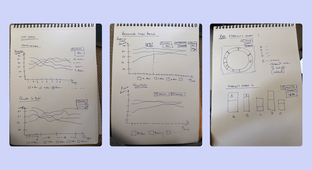
Sketches
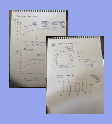
We developed sketches for the dashboard, enhancing UI elements to improve usability and have a thoughtful approach for our graphs and charts.
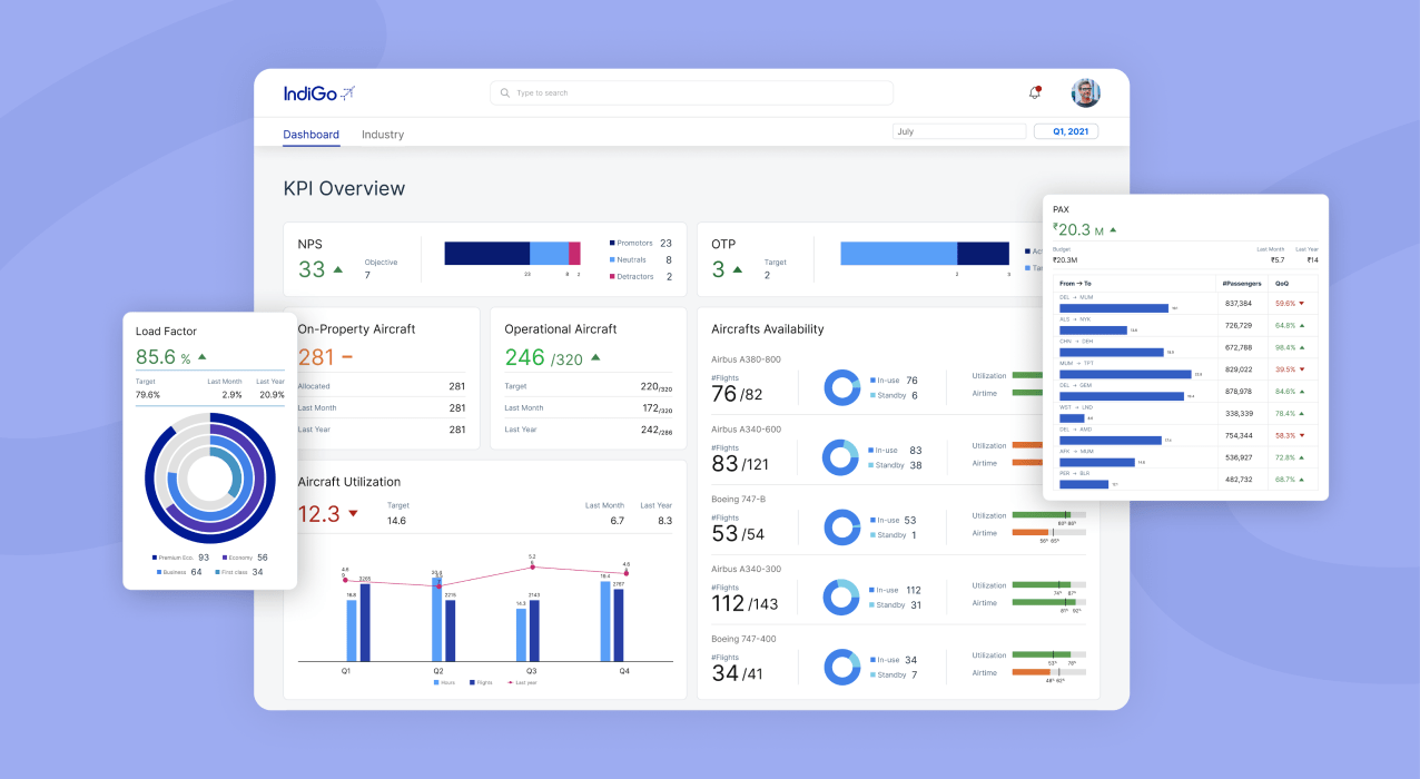
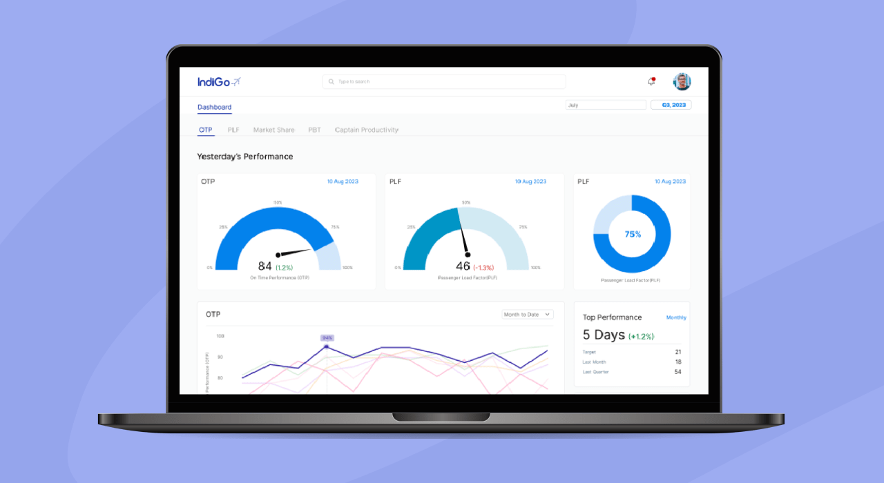
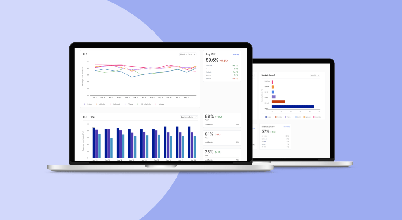
High Fidelity Designs
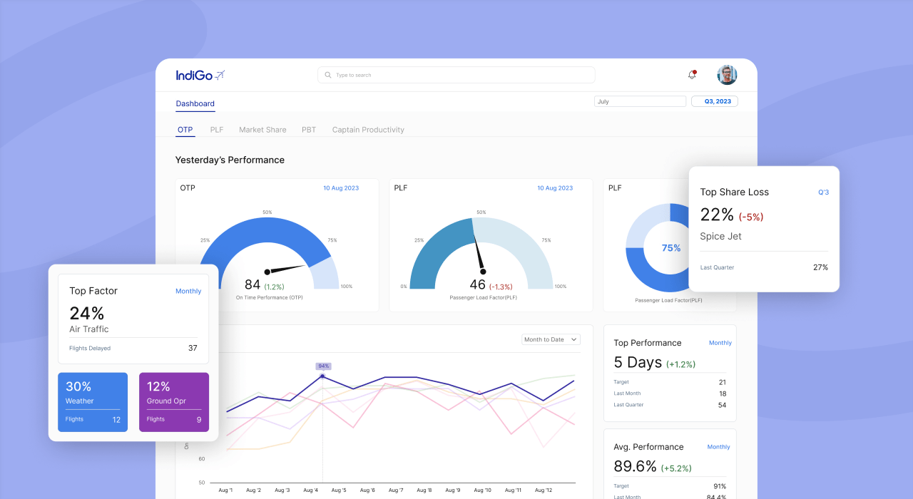
We enhanced the dashboard's visual design to improve data accessibility and user engagement, incorporating intuitive layouts and clear data visualizations.
Outcomes

Strategic Graphs
By showcasing graphs strategically, we ensured that critical insights were presented in a visually intuitive manner, enabling quicker comprehension and more informed decisions by executives.
Seamless Integration
The dashboard seamlessly integrated into Indigo’s existing design system, maintaining brand consistency while providing an intuitive and user-friendly interface for professionals.
Decision-Making Efficiency
The dashboard provided CFOs with real-time access to essential data points, resulting in faster and more accurate decision-making, significantly improving governance processes.
