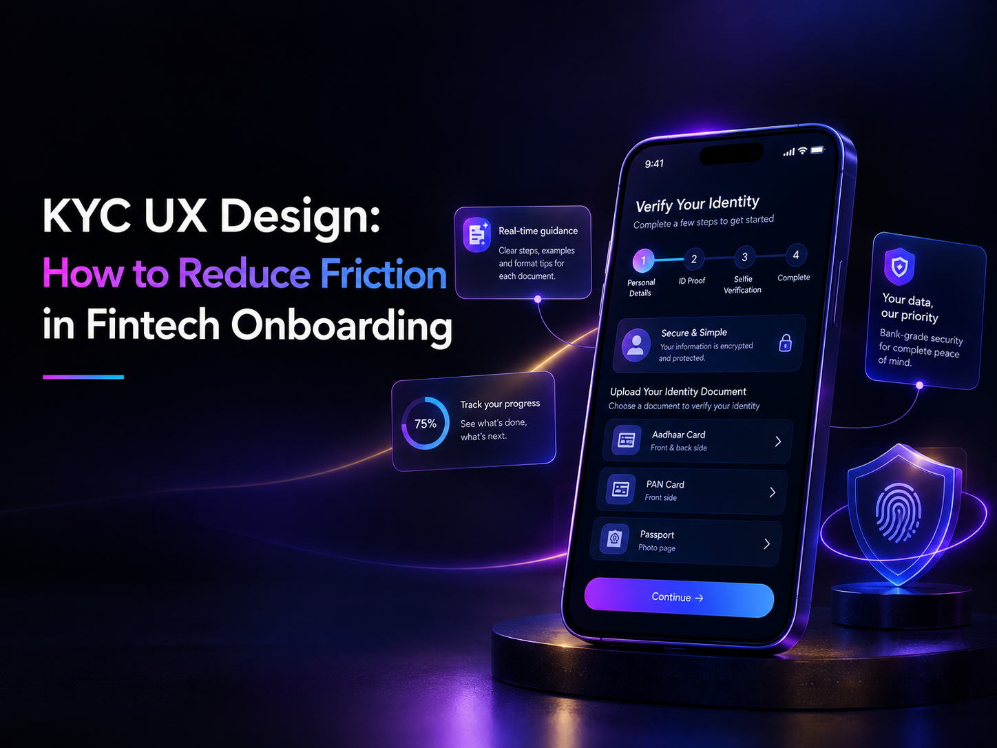
KYC is one of the most important steps in fintech onboarding, but it can also be one of the biggest sources of friction. Users may be asked to enter personal information, upload identity documents, complete verification and wait for approval before they can access the product.
For fintech companies, these steps are necessary. For users, they can feel lengthy, repetitive or unclear, especially when they encounter an error without knowing how to fix it.
This is where KYC UX design plays an important role. Good UX cannot remove regulatory requirements, but it can make them easier to understand and complete. Clear instructions, visible progress, helpful error messages and timely communication can turn KYC from a frustrating checkpoint into a predictable part of the onboarding experience.
Why KYC Creates Friction in Fintech Onboarding
KYC often sits between a user’s initial interest in a financial product and their ability to actually use it. The longer or more confusing this process feels, the greater the chance of users dropping out before completing onboarding.
KYC Adds Complexity to an Already Long Journey
A typical fintech onboarding journey may involve several steps:
Sign up → Enter personal details → Verify identity → Upload documents → Complete KYC → Activate account
Each step introduces another interaction that users need to understand and complete. Asking for the same information more than once, moving between different screens or introducing unexpected verification requirements can make the journey feel longer than it needs to be.
The design challenge is to make each step feel purposeful and manageable.
Users Don’t Always Know What Is Expected
A simple instruction such as “Upload your ID” may leave users with several questions:
- Which document should I upload?
- Are digital copies accepted?
- Do I need to upload both sides?
- What image quality is required?
- What happens after I upload it?
- How long will verification take?
When the interface doesn’t answer these questions, users have to guess. This creates hesitation and increases the likelihood of failed submissions.
Compliance and User Experience Need to Work Together
KYC requirements cannot simply be removed to create a shorter onboarding journey. The opportunity for designers is to make the required process easier to understand and navigate.
Every mandatory step should have a clear purpose, straightforward instructions and an obvious next action. This allows fintech products to maintain the necessary verification process while creating a smoother onboarding experience.
Design a Simpler KYC Onboarding Flow
A good fintech onboarding UX makes the verification journey feel structured rather than overwhelming. Users should always understand where they are, what they need to do and what comes next.
Break KYC Into Manageable Steps
Instead of presenting a long form or multiple requirements on one screen, group related tasks into logical stages.
For example:
Personal information → Identity document → Verification → Confirmation
Each stage should have one clear primary action. This reduces cognitive load and makes a potentially complicated process easier to navigate.
Show Progress Clearly
Progress indicators can give users a sense of control, particularly when onboarding involves several steps.
A simple indicator such as:
Step 2 of 4 — Identity verification
helps users understand how much of the process is complete and what remains.
Completion states are equally important. Once a step has been successfully completed, the interface should make that clear rather than leaving users wondering whether their information was saved.
Set Expectations Before Verification Begins
Before users start KYC, tell them what they will need and what to expect.
For example:
“Keep your PAN card and Aadhaar ready. You’ll need to verify your identity and complete a short verification process.”
If verification may take additional time, communicate that upfront. Setting expectations early reduces uncertainty and makes delays less frustrating.
The principle is simple: don’t make users discover the requirements halfway through the process.
Make Document Upload Easier
Document submission is often one of the most frustrating parts of KYC app design. Users may be asked to capture an ID, upload an existing file or provide multiple documents. Small gaps in instructions can result in failed uploads and repeated attempts.
Tell Users Exactly What to Upload
Avoid generic instructions such as “Upload ID proof.” Tell users which documents are accepted and what is required.
Useful information can include:
- Accepted document types
- Whether the front and back are required
- File or image requirements
- Whether a digital copy is acceptable
- What happens after submission
The information should appear before the upload action so users can prepare the right document.
Guide Users During Document Capture
For camera-based verification, provide simple, contextual guidance. Users may need help positioning the document correctly or avoiding glare and poor lighting.
Short instructions such as “Place the document inside the frame” or “Make sure all four corners are visible” are more useful than showing a long list of requirements before the camera opens.
Where possible, real-time feedback can help users correct the image before submitting it. This reduces failed attempts and avoids making users repeat the process.
Confirm Successful Uploads
After a document is uploaded, give users a clear confirmation. A preview of the document, its name or document type, and an option to replace it can help users verify that they submitted the intended file.
The interface should make the transition to the next step obvious. Users shouldn’t have to wonder whether the upload was successful or whether they need to take another action.
Design Better Verification and Error States
A smooth KYC journey isn’t just about preventing errors. It also needs to help users recover when something goes wrong.
Explain Errors in Human Language
Messages such as “Verification failed” provide very little guidance. Users need to understand both the problem and the next step.
For example:
“We couldn’t read the document clearly. Please upload a sharper image with all four corners visible.”
A useful error message should answer three questions:
What happened? → Why did it happen? → What should I do now?
Let Users Fix Problems Without Starting Over
If a document is rejected or information needs correction, users should be able to return to the relevant step without repeating the entire KYC process.
Where possible, preserve information that has already been submitted. Allow users to replace an incorrect document, edit incorrect details or retry verification directly from the point of failure.
This is particularly important in fintech onboarding UX, where unnecessary repetition can turn a small error into a reason for abandoning the entire journey.
Design for Verification Delays
Not every verification will be completed instantly. When additional review is required, don’t leave users with a vague loading screen.
A clear status message can explain:
“Your documents have been submitted. We’re reviewing your information and will notify you once verification is complete.”
If an estimated timeframe is available, communicate it. Even when users have to wait, knowing what is happening can make the experience feel more reliable.
Make Consent and Privacy Easy to Understand
KYC requires users to share sensitive personal information, so trust depends on more than completing the verification process. Users also need to understand why their information is being collected and what they are agreeing to.
Explain Why Information Is Being Collected
Instead of presenting every requirement as a mandatory form field, provide brief context where it helps.
For example:
Why do we need your PAN?
We use it to verify your identity and complete your account verification.
A short explanation can make an otherwise intrusive request feel more transparent and purposeful.
Make Consent Clear
Consent should be easy to identify and understand. Important permissions should not be hidden within long blocks of legal language or bundled together with unrelated actions.
Use clear labels and distinguish between:
- Information required for KYC
- Optional permissions
- Marketing or communication preferences
- Terms and conditions
The objective is to help users understand what they are agreeing to before they proceed.
Give Users Confidence About Their Information
Privacy communication should be part of the KYC experience. Where relevant, explain how personal information is handled, why it is needed and how it is protected.
A concise privacy message at the right point in the journey can be more effective than expecting users to navigate a lengthy privacy policy before they can continue.
Communicate Throughout the KYC Journey
Once users submit their information, uncertainty can become another source of friction. A good KYC experience continues to communicate even when the user isn’t actively completing a step.
Confirm Every Important Action
Users should receive clear feedback when they:
- Submit personal information
- Upload a document
- Complete verification
- Move to manual review
- Finish KYC successfully
For example, after document submission, “Document uploaded successfully” immediately confirms that the action worked.
Keep Users Updated During Delays
If verification is pending, users should know that their submission has been received and understand what happens next.
Instead of simply showing “Verification pending,” provide useful context:
“Your documents have been received and are being reviewed. We’ll notify you when verification is complete.”
If the process requires additional information, communicate that clearly rather than leaving users to discover it later.
Keep Communication Consistent Across Channels
KYC communication may continue through the app, email, SMS or push notifications. The status, terminology and next steps should remain consistent across these touchpoints.
A user who receives “Verification in progress” in the app should not receive a different or confusing status through email.
Consistent communication makes the entire fintech onboarding experience feel more predictable and trustworthy.
Design KYC for Real-World User Conditions
KYC doesn’t always happen in ideal conditions. Users may be completing onboarding on a mobile device, dealing with poor connectivity, using an older phone or switching between apps to find their documents. A strong KYC experience should account for these situations rather than assuming every user has a perfect connection and high-quality camera.
Account for Interrupted Sessions
Document uploads and verification can take time. If a user loses connectivity or closes the app midway, they shouldn’t have to start from the beginning.
Where possible, save completed information and allow users to resume from the last completed step. Clear session states can also help users understand whether their previous information was successfully saved.
Design for Different Devices and Contexts
Many fintech onboarding journeys are completed on mobile devices, making the quality of the camera, screen size and connectivity important considerations for KYC app design.
Document capture, image previews, input fields and verification screens should remain easy to use across different device sizes. Buttons and instructions should be clearly visible, particularly during camera-based document capture.
Make Accessibility Part of KYC UX
Accessibility also contributes to a smoother verification experience. Clear typography, readable instructions, sufficient touch targets and understandable error messages can make KYC easier for a broader range of users.
The goal is to ensure that completing a mandatory financial process doesn’t become unnecessarily difficult because of the way the interface is designed.
A Practical KYC UX Checklist
Before launching or redesigning a fintech onboarding flow, designers can use this checklist to identify common sources of friction:
| Area |
UX question |
| Instructions |
Does the user know exactly what information is required? |
| Progress |
Can users see where they are in the process? |
| Documents |
Are upload and capture requirements clear? |
| Verification |
Do users know what happens after submission? |
| Errors |
Does every error explain the problem and next step? |
| Consent |
Is the purpose of data collection understandable? |
| Communication |
Are users updated throughout the process? |
| Recovery |
Can users resume without repeating completed steps? |
| Accessibility |
Can different users complete KYC comfortably? |
A KYC journey that performs well across these areas is easier to navigate and more reassuring for users. It also gives product teams a practical framework for identifying friction before it affects onboarding completion.
How Better KYC UX Supports Fintech Growth
KYC is more than a compliance checkpoint. It is one of the first meaningful interactions users have with a fintech product, which makes it an important part of the overall customer experience.
Reduce Friction at Critical Steps
Every unclear instruction, unnecessary form field or unexplained error can create hesitation during onboarding. Simplifying these interactions can help users move through verification with fewer interruptions.
The focus should be on removing avoidable friction while retaining the information and checks required for compliance.
Build Trust From the First Interaction
Users are sharing personal and financial information before they have fully experienced the product. A clear KYC journey can establish confidence early by showing that the fintech product is organised, transparent and respectful of the user’s information.
Small details matter: clear instructions, predictable progress, understandable errors and timely updates can collectively shape the user’s perception of the brand.
Balance Compliance With Usability
The strongest KYC experiences don’t attempt to hide the verification process. They make it clear, guided and manageable.
For product teams, this means treating KYC as part of the product experience rather than a separate compliance layer. When compliance requirements and UX decisions work together, onboarding can remain secure while feeling significantly easier for the user.
How Design Brewery Approaches Fintech UX
Designing a smoother fintech onboarding experience starts with understanding the complete user journey. At Design Brewery, our approach combines product thinking, UX design, information architecture and usability to simplify complex financial experiences.
Designing Around Real User Journeys
We evaluate key product flows to identify where users encounter confusion, unnecessary steps or unclear information. This can include reviewing navigation, information hierarchy, forms, interactions and critical financial journeys.
The objective is to create interfaces that help users understand what they need to do and move confidently through the product.
Applying This Approach to Complex Financial Products
Our work with Wealthy Nivesh involved a comprehensive redesign of its web and mobile product. The experience brought together complex wealth-management information for a diverse audience.
The redesign focused on creating intuitive user flows, reducing jargon and visual clutter, and developing a scalable design system that could support future product requirements.
The same principle applies to KYC: complexity can exist within the product without becoming complexity for the user.
Conclusion: Make KYC Feel Like Part of the Product
KYC is essential to fintech onboarding, but it doesn’t have to feel like a barrier between users and the product.
Good KYC UX design makes every step easier to understand, from knowing which document to upload and tracking verification progress to understanding errors, giving consent and knowing what happens next.
The goal isn’t simply to make onboarding shorter. It is to make the required process clearer, more predictable and easier to complete.
When compliance and UX work together, KYC becomes more than a verification step. It becomes an opportunity to establish trust from the very first interaction.