Redesigned Packaging for Premium Nutrition Supplements
Industry
FMCG
Timeline
2 months
Challenge
The challenge was to capture Provee’s commitment to balanced growth for children through its brand identity and packaging. As a healthy protein nutrition product for kids, it needed to clearly highlight its key ingredients while appealing to both children and their parents.
Packaging Design
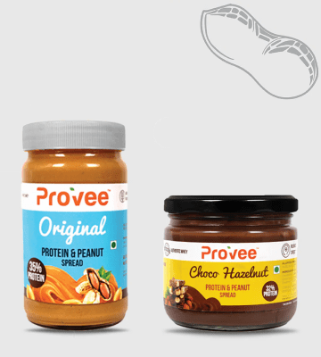
Created packaging design to reflect the product's quality and nutritional benefits
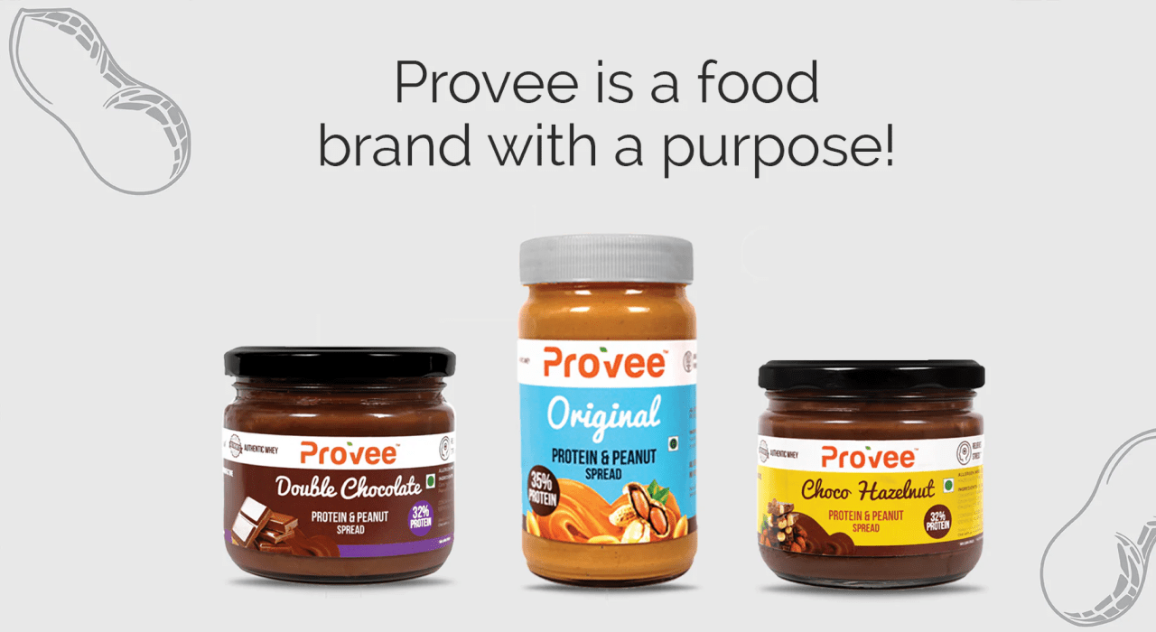
Product Variants
Designed multiple packaging variations for Provee, tailored to different product flavors while maintaining a cohesive brand identity.
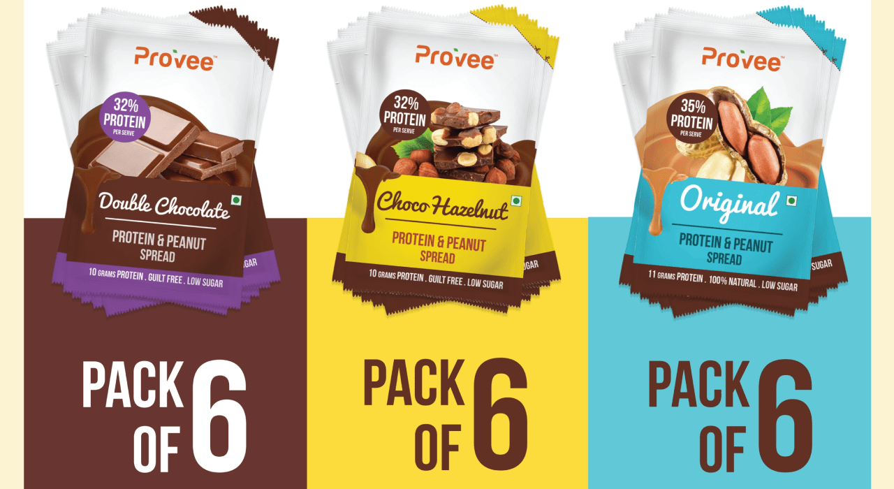
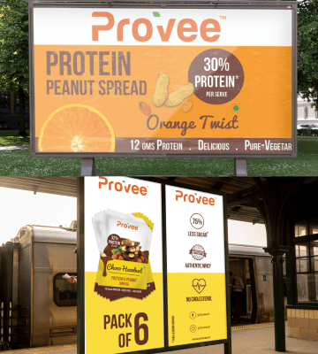
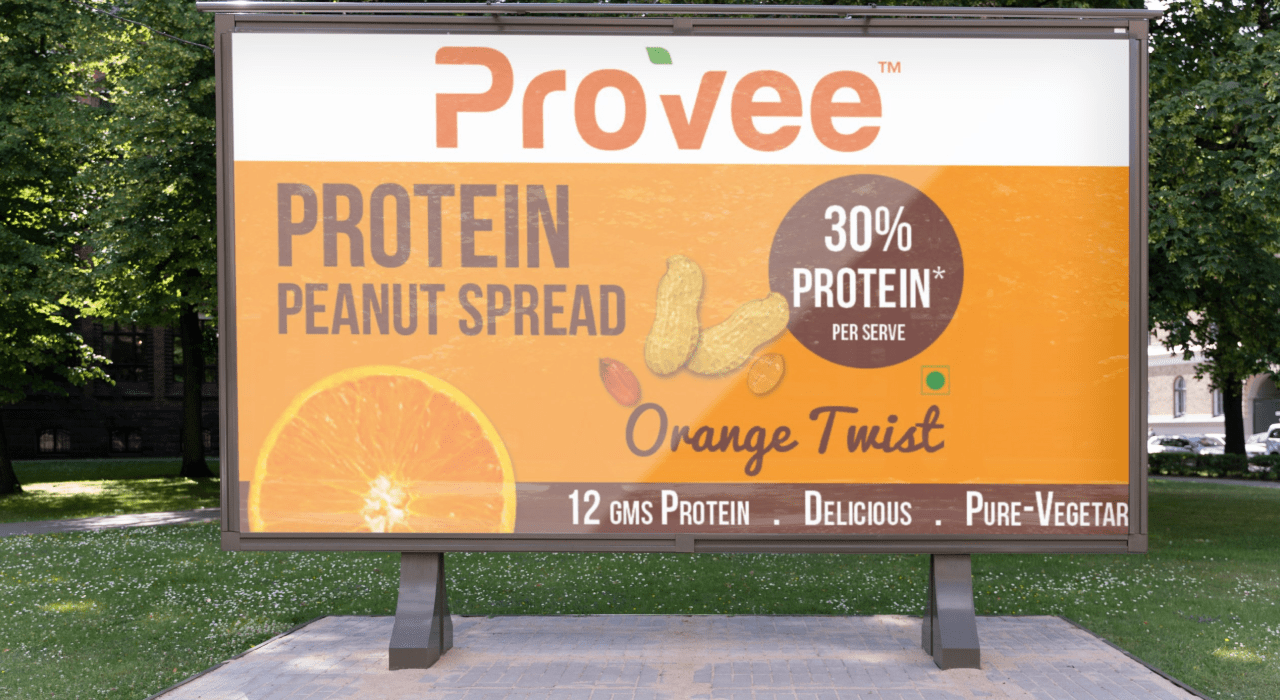
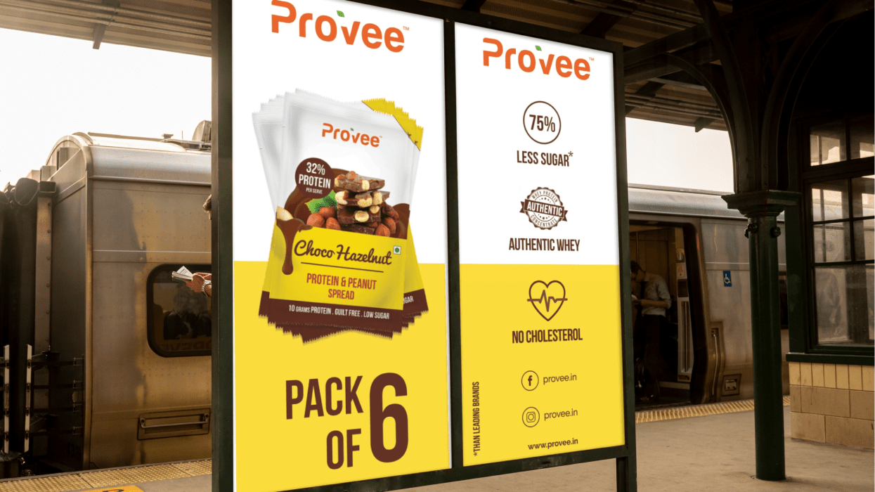
Brand Collaterals
Outcomes

Family-Friendly Market Position
Positioned Provee as an approachable, family-friendly protein brand that meets both the nutritional and taste needs of all age groups, enhancing its appeal to a broad customer base.
Seamless Brand Identity
Developed a unified brand identity that effectively communicates Provee’s commitment to balanced nutrition, using vibrant, child-friendly packaging while maintaining an appeal to all age groups.
Enhanced Brand Recognition
Established a distinctive visual identity through standout packaging and clear messaging, making Provee easily recognizable on shelves. This created stronger brand awareness among families and health-conscious consumers.
