Financial apps sit at the intersection of money, personal data, security, and everyday decision-making. A user may open a banking or payment app simply to check a balance, but within seconds they may need to transfer money, verify their identity, review a transaction, or respond to a security alert.
This makes fintech app design different from designing a conventional consumer app. Every interaction needs to be clear, predictable, and trustworthy while keeping necessary security and compliance steps manageable.
The best financial apps achieve this through a set of proven UX patterns across the entire user journey – from onboarding and KYC to payments, transaction history, notifications, security, and support.
For example, Paytm describes its redesigned app around making payments and money management simpler, with features such as payment search, downloadable statements, spend categorization, and detailed transaction information.
This guide explores the key fintech app UX patterns that financial products should consider when designing a simple, secure, and user-friendly experience.
What Makes Fintech App UX Different?
A financial app needs to balance ease of use with trust and control. Users need to understand where their money is, what an action will do, and whether a transaction has been completed successfully.
Three principles are particularly important:
- Clarity: Financial information, fees, transaction details, and next steps should be easy to understand.
- Security: Authentication, fraud prevention, and transaction verification need to be integrated without creating unnecessary friction.
- Feedback: Users should receive clear confirmation when an action succeeds, fails, or requires attention.
Popular fintech apps demonstrate these principles through practical features. For example, Revolut provides in-app fraud warnings, transaction notifications, card controls, biometric authentication, and a dedicated security area.
Good financial app design therefore focuses on the complete user journey rather than just creating visually attractive screens.
1. Simple and Progressive Onboarding
The first few minutes can determine whether a user completes registration or abandons the app. Fintech onboarding needs to collect necessary information while giving users a clear understanding of what they are signing up for.
Keep Registration Simple
Ask only for information that is necessary at the initial stage. Familiar options such as mobile number, email, passkeys, or biometric authentication can make sign-up faster.
The first screen should also communicate the product’s core value clearly. Users should understand what they can do with the app before being asked to complete a lengthy registration process.
Show Progress and Expectations
If onboarding requires several steps, show users where they are in the process.
For example:
Create account → Verify identity → Set security → Account ready
Progress indicators can reduce uncertainty, particularly when onboarding involves KYC or document verification.
Use Progressive Onboarding
A long registration form can make a financial app feel complicated before the user has even experienced its value.
Instead, collect information progressively where regulations and the product flow allow it. Ask for additional details when they become relevant to a particular feature or transaction.
This approach can make fintech app UX feel more manageable while still supporting the information requirements of the product.
2. Low-Friction KYC Experience
KYC is often one of the most important steps in a financial app, but it can also become a major source of friction. Users may need to submit identity details, documents, photographs, or other information before they can access financial services.
Good fintech app design should make this process feel structured and predictable.
Explain Why Information Is Needed
Users are more likely to complete a verification process when they understand why information is being requested.
Brief explanations can clarify why the app needs identity details or a particular document without forcing users to navigate lengthy explanations.
Make Document Submission Easy
The interface should clearly communicate:
- Which documents are accepted
- Whether the document needs to be photographed or uploaded
- How the document should be positioned
- Whether all details need to be visible
- What happens after submission
Camera-based document capture, automatic image quality checks, and clear instructions can reduce avoidable errors.
Communicate Verification Status
Never leave users wondering whether their KYC is complete.
Use clear states such as:
Verification required → Submitted → Under review → Verified
If verification fails, explain the reason and provide a clear next step. A generic “Verification failed” message creates uncertainty and often sends users toward customer support.
3. Clear and Actionable Financial Dashboards
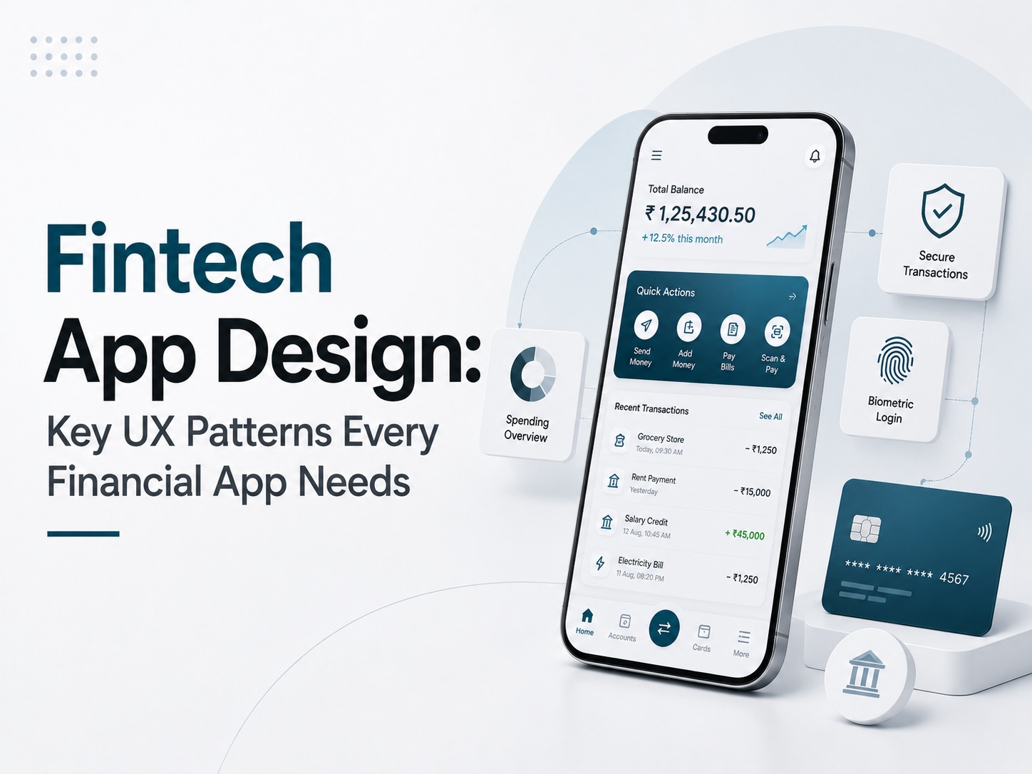
The dashboard is often the most frequently visited screen in a financial app. It needs to answer a basic question quickly:
“What is happening with my money?”
A good dashboard combines financial information with relevant actions without overwhelming the user.
Prioritize Key Information
The most important information depends on the type of financial product.
A banking app may prioritize:
- Available balance
- Recent transactions
- Upcoming payments
- Cards
- Transfers
An investment app may prioritize:
- Portfolio value
- Returns
- Asset allocation
- Market performance
The hierarchy should reflect what users actually need most frequently.
Use Data Visualization Carefully
Charts can make financial information easier to understand, but visual complexity can reduce usability.
Use charts and graphs when they help users identify trends, compare values, or understand their financial position.
For example, spending categories can help users quickly identify where their money is going, while an investment dashboard can use performance charts to show changes over a selected period.
The principle is simple: visualize information when it improves understanding, not simply to make the interface look sophisticated.
Make Key Actions Easy to Find
Important actions should be accessible from the dashboard.
Depending on the product, these might include:
Send Money | Add Funds | Pay Bills | View Transactions | Manage Card
Good fintech UI design balances information and action so users can move from understanding their financial position to completing the next task without unnecessary navigation.
4. Seamless Payment and Transfer Flows
Payments are among the highest-risk interactions in a financial app. A user needs confidence that they are sending the correct amount to the correct recipient and that the transaction has been completed.
A typical payment journey can follow:
Select recipient → Enter amount → Review details → Authenticate → Confirm → View status
Make Recipient and Payment Details Clear
The payment screen should make critical information immediately visible.
Depending on the transaction, this can include:
- Recipient name
- Account or payment identifier
- Amount
- Payment method
- Fees
- Transaction limits
Visual hierarchy is particularly important here because users should not have to search the screen to verify important details.
Add a Review Before Confirmation
A dedicated review step gives users one final opportunity to catch mistakes.
For example:
Paying: Rahul Sharma
Amount: ₹5,000
Fee: ₹0
Total: ₹5,000
The primary confirmation action should be clear, while the option to go back and edit information should remain easy to access.
Design Clear Success and Failure States
The experience should clearly distinguish between:
- Successful
- Pending
- Failed
- Reversed
A successful payment should provide confirmation and, where relevant, a transaction reference.
A failed payment should explain what happened and what the user should do next. If money was deducted despite a failed payment attempt, the interface should clearly communicate the status rather than leaving users uncertain.
This is one of the most important areas where financial app design can build or damage user trust.
5. Scannable Transaction History
Users frequently return to transaction history to verify payments, check spending, download records, or investigate unfamiliar activity.
The transaction screen therefore needs to support quick scanning and deeper investigation.
Use Clear Transaction Information
Each transaction should make the most important details immediately visible:
- Merchant or recipient
- Amount
- Date
- Transaction type
- Status
Users should be able to distinguish between completed, pending, failed, and reversed transactions without opening every transaction individually.
Add Search and Filters
As transaction volume grows, scrolling through a long list becomes inefficient.
Useful filters can include:
- Date
- Amount
- Transaction type
- Category
- Payment status
Search can also help users quickly locate a specific merchant, recipient, or transaction.
Provide Detailed Transaction Views
Opening an individual transaction should provide deeper information such as:
- Transaction reference
- Payment method
- Fees
- Date and time
- Status
- Recipient or merchant details
- Receipt or statement options
This layered approach keeps the main transaction list clean while making detailed information available when users need it.
6. Relevant and Actionable Notifications
Notifications are an important part of fintech app UX because users need timely information about transactions, payments, security events, and account activity.
However, financial apps should prioritize useful notifications over notification volume.
Prioritize Important Alerts
Not every notification has the same importance.
Security alerts, transaction confirmations, payment failures, and unusual account activity generally deserve greater prominence than promotional messages.
Users should be able to immediately recognize which notifications require attention.
Make Notifications Actionable
A useful notification answers three questions:
What happened? → Why does it matter? → What should I do?
For example, instead of:
“Payment alert.”
A more useful notification might identify the transaction, amount, status, and relevant action.
This is particularly important for fraud-related alerts, where users may need to review or block an activity quickly.
Give Users Appropriate Control
Users should be able to manage relevant notification preferences, such as promotional messages or certain informational alerts.
However, essential security and transaction notifications should remain appropriately protected from being accidentally disabled.
Good fintech UI design treats notifications as part of the financial journey rather than simply another engagement channel.
7. Profile and Security Controls
The profile area is often where users manage personal information, account preferences, linked accounts, and security settings. It should provide enough control without becoming difficult to navigate.
Organize Account Information
Depending on the product, users may need access to:
- Personal details
- Linked bank accounts
- Cards and payment methods
- Preferences
- Communication settings
- Documents
- Account information
Grouping related settings makes them easier to find and reduces navigation friction.
Make Security Settings Accessible
Security controls should not be buried deep inside the app.
Users may need to manage:
- Passwords or PINs
- Biometric authentication
- Multi-factor authentication
- Logged-in devices
- Transaction limits
- Security alerts
Apps such as Revolut provide users with controls around card security, biometrics, device access, and transaction monitoring, demonstrating how security can be incorporated into everyday product UX.
Design Clear Account Recovery
Users can lose access to passwords, devices, phone numbers, or authentication methods.
Account recovery should provide a clear and secure path for regaining access without forcing users into confusing loops.
Every recovery state should explain what information is required, what happens next, and how the user can get additional help if recovery fails.
8. In-App Customer Support
Financial problems can be urgent. A failed payment, blocked account, KYC issue, or suspicious transaction can require immediate assistance.
For this reason, customer support should be treated as part of the product experience rather than an afterthought.
Make Help Easy to Find
Users should not have to navigate through multiple menus to find support.
Depending on the product, support can include:
- Help centre
- Search
- Chat
- FAQs
- Phone support
- Email
- Issue reporting
The most appropriate option depends on the complexity and urgency of the problem.
Provide Context-Aware Support
If a user is reporting a problem with a specific transaction, the app should provide relevant transaction details to support where possible.
This reduces the need for users to repeatedly explain:
What happened → Which transaction was affected → When it happened → What they need help with
It also helps support teams resolve issues faster.
Show Support Status
When an issue requires investigation, users should be able to see its status.
For example:
Issue reported → Under review → Additional information required → Resolved
This reduces uncertainty and prevents users from repeatedly contacting support simply to find out what is happening.
Common Fintech App UX Mistakes to Avoid
Even a visually polished app can deliver a poor experience if fundamental UX issues are overlooked.
Common mistakes include:
- Long onboarding: Asking for too much information before demonstrating value.
- Confusing KYC: Providing unclear instructions or generic verification errors.
- Overloaded dashboards: Showing too many numbers, charts, promotions, and notifications.
- Unclear payment flows: Making it difficult to verify recipients, amounts, or fees.
- Poor transaction states: Failing to clearly distinguish successful, pending, and failed transactions.
- Excessive notifications: Treating promotional and critical financial alerts equally.
- Hidden security controls: Making account protection and device management difficult to access.
- Hard-to-find support: Leaving users without an obvious path when something goes wrong.
These issues may seem small individually, but they can have a significant impact on trust and task completion.
Final Takeaway
Effective fintech app design is built around the moments that matter most to users: joining the product, verifying their identity, understanding their finances, moving money, checking transactions, managing security, and getting help when something goes wrong.
The most important UX patterns include:
- Simple and progressive onboarding
- Low-friction KYC
- Clear financial dashboards
- Predictable payment flows
- Scannable transaction history
- Relevant notifications
- Accessible profile and security controls
- In-app customer support
The best fintech app UX makes complex financial interactions feel simple while giving users the information and control they need to make confident decisions.
For fintech businesses, thoughtful fintech UI design is therefore more than a visual exercise. It is an important part of building a financial product that users can understand, trust, and use repeatedly.